
Boost Bookings With Color: The Design
Secret Every AirBnb Host Needs to Know
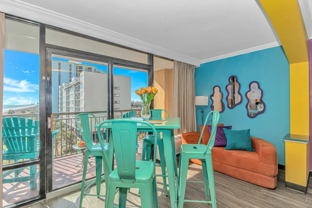
Color does more than make a space look beautiful—it shapes how guests feel the moment they walk through the door. For Airbnb hosts, that emotional first impression can be the difference between a one-time stay and a fully booked calendar. In this article, we’ll explore how strategic color choices can transform your vacation rental into an unforgettable experience that stands out in a crowded market.
You’ll learn the basics of color psychology, how to match palettes to your property’s location and target guests, and which tones encourage relaxation, energy, or luxury. We’ll also cover practical tips for creating cohesive, photo-ready spaces that shine in listings and help convert clicks into confirmed bookings. If you want your rental to not only look good but feel irresistible, it all starts with the right color strategy!
COLOR PSYCHOLOGY
Color psychology is all about how different hues influence mood, behavior, and perception—and in a vacation rental, that emotional response directly impacts guest satisfaction, reviews, and bookings. The goal isn’t just to decorate, but to create a feeling guests instantly connect with. Warm colors like reds, oranges, and yellows tend to feel energetic, social, and inviting. They work well in gathering spaces like living rooms or dining areas where you want conversation and activity.
Cool colors like blues, greens, and soft purples are calming and restorative—ideal for bedrooms and bathrooms where guests want to relax and recharge.
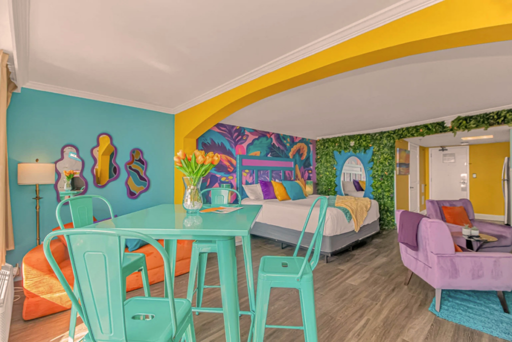
What Experience Are You Selling?
Think about why guests are choosing your property:
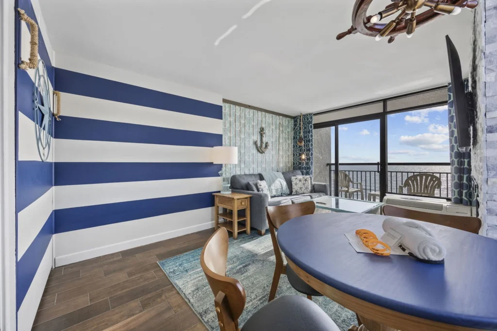
- Beach or lake homes: Soft blues, sandy neutrals, and seafoam greens create a serene, coastal vibe
- Mountain or cabin stays: Earthy tones like deep greens, browns, and warm taupes feel grounded and cozy
- City or luxury rentals: Neutrals with bold accents (black, navy, gold) signal sophistication and style
Your color palette should reinforce the mood of the stay and turn your Airbnb into an experience!
Build Your Mood With Neutrals
Whites, creams, grays, and beiges make spaces feel clean, spacious, and versatile. They also photograph well—crucial for online listings. Use neutrals as your base, then layer in color through accents like pillows, art, or furniture.
Add Personality With Accent Colors
- Accent colors are where your property becomes memorable. A pop of terracotta, mustard, or teal can add warmth and uniqueness without overwhelming the space. This is especially important for standing out in listing photos.
- Soft, muted tones = calming, upscale, relaxing
- Bright, saturated colors = playful, energetic, bold
For most vacation rentals, softer tones tend to appeal to a wider audience, while bold colors work best as controlled accents.
Matching You Color Palette to
Your property’s location
-and target guests
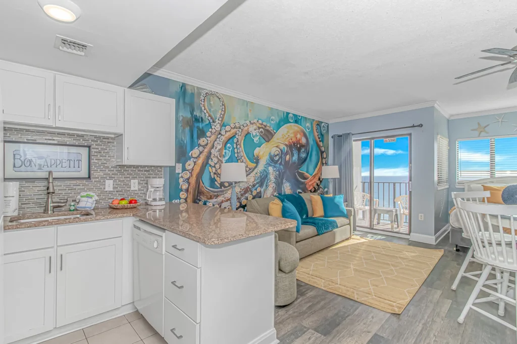
Choosing the right color palette starts with aligning your design to both your property’s location and the type of guests you want to attract. For example, one of our beachfront properties in Myrtle Beach combines sunny yellows and ocean blues to instantly reflect its coastal setting, while incorporating a unique octopus-patterned wallpaper as a statement feature!
A mountain cabin might lean into earthy greens and warm wood tones to create a cozy, grounded retreat, while a city rental can feel elevated and modern with sleek neutrals and bold, high-contrast accents. For small-town stays, soft, welcoming hues often create that charming, relaxed atmosphere guests are looking for.
Who Is Your Guest?
Just as important, is designing for your audience—young groups celebrating birthdays may respond to playful pops of color and Instagram-worthy features, honeymooners tend to gravitate toward soft, romantic tones, and families often appreciate calm, durable palettes that feel both inviting and practical.
Creating a memorable, photo-ready space that stands out among a sea of listings and gives guests a stay they’ll instantly associate with fun, personality, and luxury.

The Luxury Color Secret
Luxury in a vacation rental is often communicated through a refined, intentional color palette rather than overly bold design. Deep, rich tones like charcoal, navy, forest green, and warm taupe tend to signal sophistication and exclusivity, especially when paired with soft neutrals like cream or ivory to keep the space balanced and elevated. These colors create a sense of calm confidence that photographs beautifully and subtly tells guests “this stay is premium.”
Furniture Features
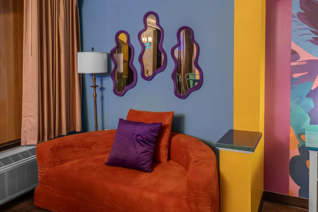
The effect becomes even more powerful when paired with complementary accents—think vintage-inspired furniture, sculptural chairs, or a standout piece like a velvet sofa or antique wood table. These elements add depth, character, and a and a curated feel that guests associate with high-end experiences rather than generic rentals. When done well, this combination not only elevates the perceived value of your property but also makes your listing more memorable, helping it stand out in crowded marketplaces and ultimately leading to more clicks, stronger emotional connections, and increased bookings.
Furniture colors and fabrics are what take a space from simply “put together” to truly memorable—they add depth, texture, and personality that guests can see and feel. While wall colors set the foundation, furniture is where you introduce contrast and layering: a neutral room instantly becomes more dynamic with a rich velvet sofa, a leather accent chair, or linen drapery that softens the space. Mixing fabrics—like pairing smooth cottons with textured weaves or worn-in wood—creates visual interest and gives the room a curated, high-end feel. For guests, these layers translate into a richer, more immersive experience, making the space feel intentional, comfortable, and worth remembering (and booking again).
Lighting & Colors
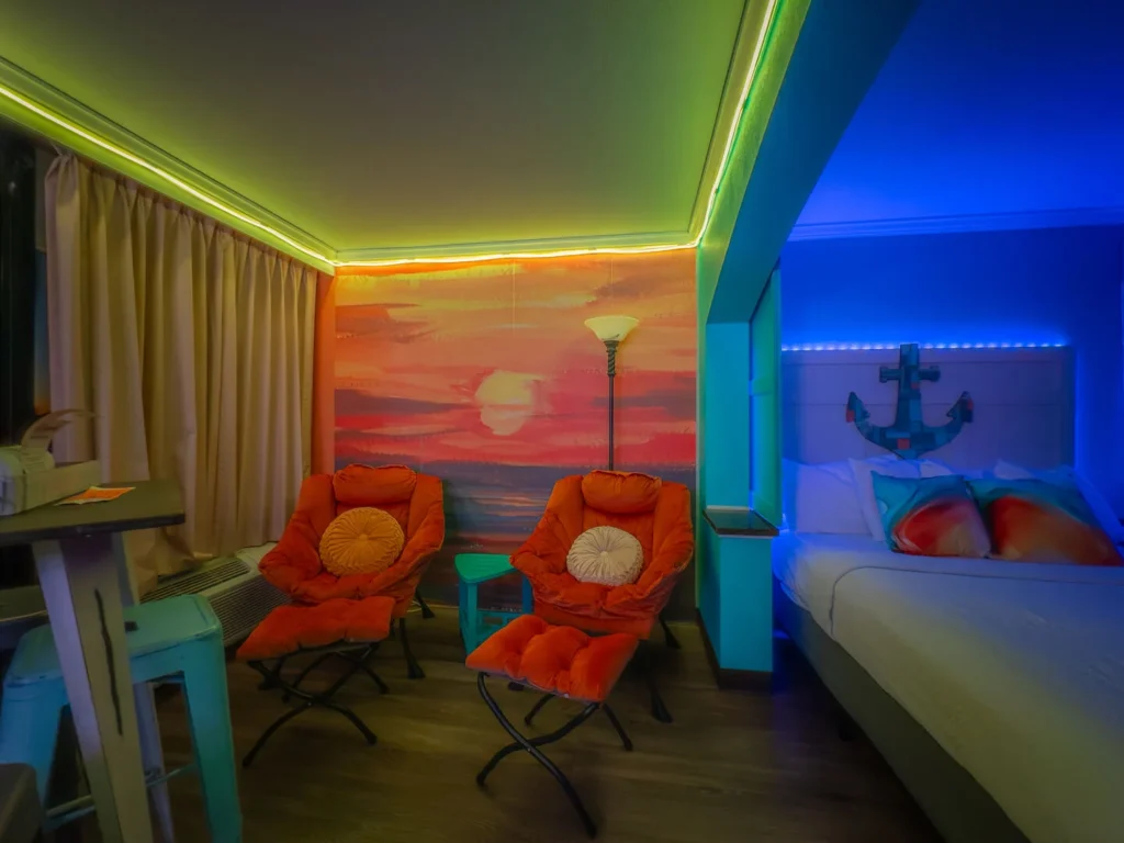
Lighting is the final layer that brings your entire color palette to life, shaping how your space feels from morning to night. Natural light streaming through windows enhances true color tones, making blues feel crisper, neutrals feel warmer, and the entire space more open and inviting—something that’s essential for eye-catching listing photos. But once the sun sets, thoughtfully placed LED lighting becomes just as important. Warm ambient lighting can soften a room for a cozy, upscale feel, while dimmable LEDs or subtle accent lighting can highlight textures, artwork, and statement pieces, making colors appear richer and more dynamic.
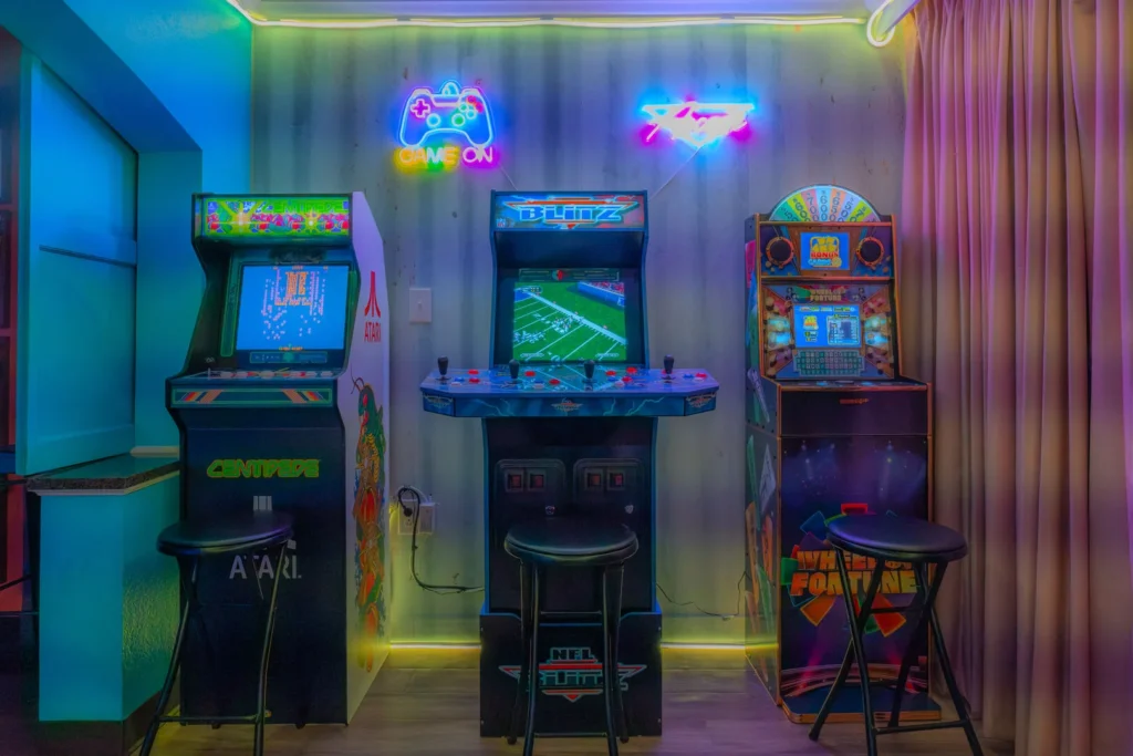
If you want your Airbnb to become the go-to birthday destination for guests of all ages, the combination of vibrant colors and strategic LED lighting can make all the difference. Bold, energetic hues instantly create a fun, celebratory atmosphere, while customizable LED lighting—think color-changing strips, accent lighting, or backlit features—lets guests transform the space to match their mood or party theme. This flexibility turns your property into more than just a place to stay; it becomes an experience guests are excited to share on social media.
Color Is Unforgettable
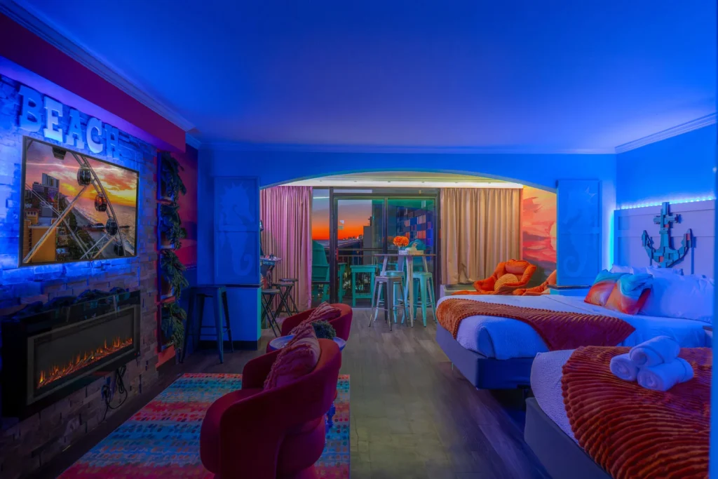
From kids’ celebrations to milestone birthdays, a space that feels lively, immersive, and photo-ready naturally attracts more attention and repeat bookings. When done right, this design approach helps position your rental as a year-round hotspot, keeping your calendar full and your listing top of mind for anyone planning a memorable milestone.
For vacation rentals, this is where you can truly elevate the experience—whether it’s a soft, romantic glow for an anniversary stay or customizable lighting that creates a fun, vibrant atmosphere for all celebrations!
When lighting is done right, it doesn’t just illuminate the space—it enhances every color choice and helps create an Instagram-worthy, luxury experience guests will associate with your property long after their stay.
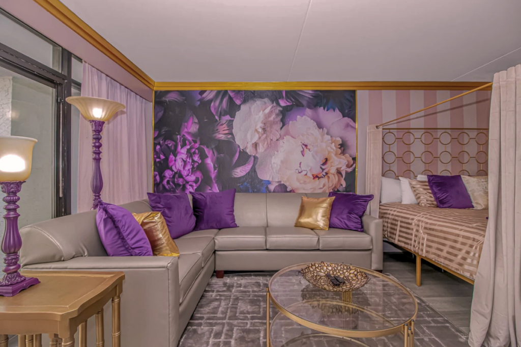
Color isn’t just decoration—it’s a strategic tool. When used thoughtfully, it can make your space feel more relaxing, more luxurious, or more fun—ultimately shaping how guests remember their stay and whether they choose to book in the first place.
At Lifted Partners, we have a passion for creativity and a commitment to elevated interior design giving guests an unforgettable experience in a competitive market. Our creatively curated designs and premium decor packages are both stunning and affordable, bringing beauty and functionality to every room. Let us upgrade your interiors within budget and create spaces you’ll love!